Usability tests revealed visitors wanted to plan their market trip in advance — which vendors to visit, what to eat, how long to spend. The existing site had no planning tools and a fragmented navigation structure.
Background
The initiative modernized St. Lawrence Market's web presence by introducing planning capabilities and improved navigation to help visitors explore the marketplace more effectively.
Problem — The original site suffered from navigation difficulties, cluttered layouts, and broken pages. 65% of users expressed frustration and desired advance planning tools.
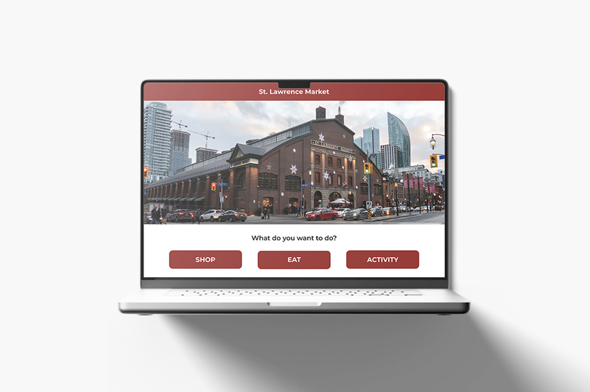
Solution — Interactive itinerary tool featuring personalized vendor recommendations, themed exploration guides, and map-based navigation to streamline visitor journeys.
Result — 85% of testers reported a significantly improved experience, with the itinerary feature driving the highest engagement.
UX Approach
Ran usability tests with 8 participants on the existing site. Observed navigation drop-off and interviewed visitors about pre-trip planning habits.
Key insight — Visitors wanted to plan — which vendors to visit, what to eat, how long to spend. The site had none of that. We designed for the pre-visit moment.
Process
Heading
Research
Planning Before the Visit
Planning Before the Visit

Image caption

Paragraph
Usability tests revealed visitors wanted to plan their market trip in advance — which vendors to visit, what to eat, how long to spend. The existing site had no planning tools and a fragmented navigation structure.
Image caption
Stats
65%
frustrated with navigation
8
usability test participants
85%
reported improved experience
Image caption
Pull Quote
I want to know what's worth visiting before I even get there.
Market visitor, usability test #3
Image caption
Heading
Design
Redesigning the Visit
Redesigning the Visit
Image caption
Image Gallery
Image caption
Side-by-Side Static
Image caption
Before — old navigation

After — task-first navigation

Stats
85%
reported improved experience
2×
more vendor pages visited per session
8
usability test participants
Image caption
Callout
Task-first navigation outperformed department-first in every test. Visitors don't think in org charts — they think in goals.
Task-first navigation outperformed department-first in every test. Visitors don't think in org charts — they think in goals.
Image caption
Design Impact
The itinerary builder drove the highest engagement across all three prototype concepts tested.
85% of testers reported a significantly improved experience
Under 15% navigation frustration, down from 65%
Highest task completion rate of any feature tested
Takeaways
Planning tools transform a transactional product into something people look forward to using. The market's character came through best when we let vendors tell their own stories.