Students in distress don't browse — they scan. Content audits and tree-testing revealed that critical resources were buried under department-first navigation, not task-first design.
Background
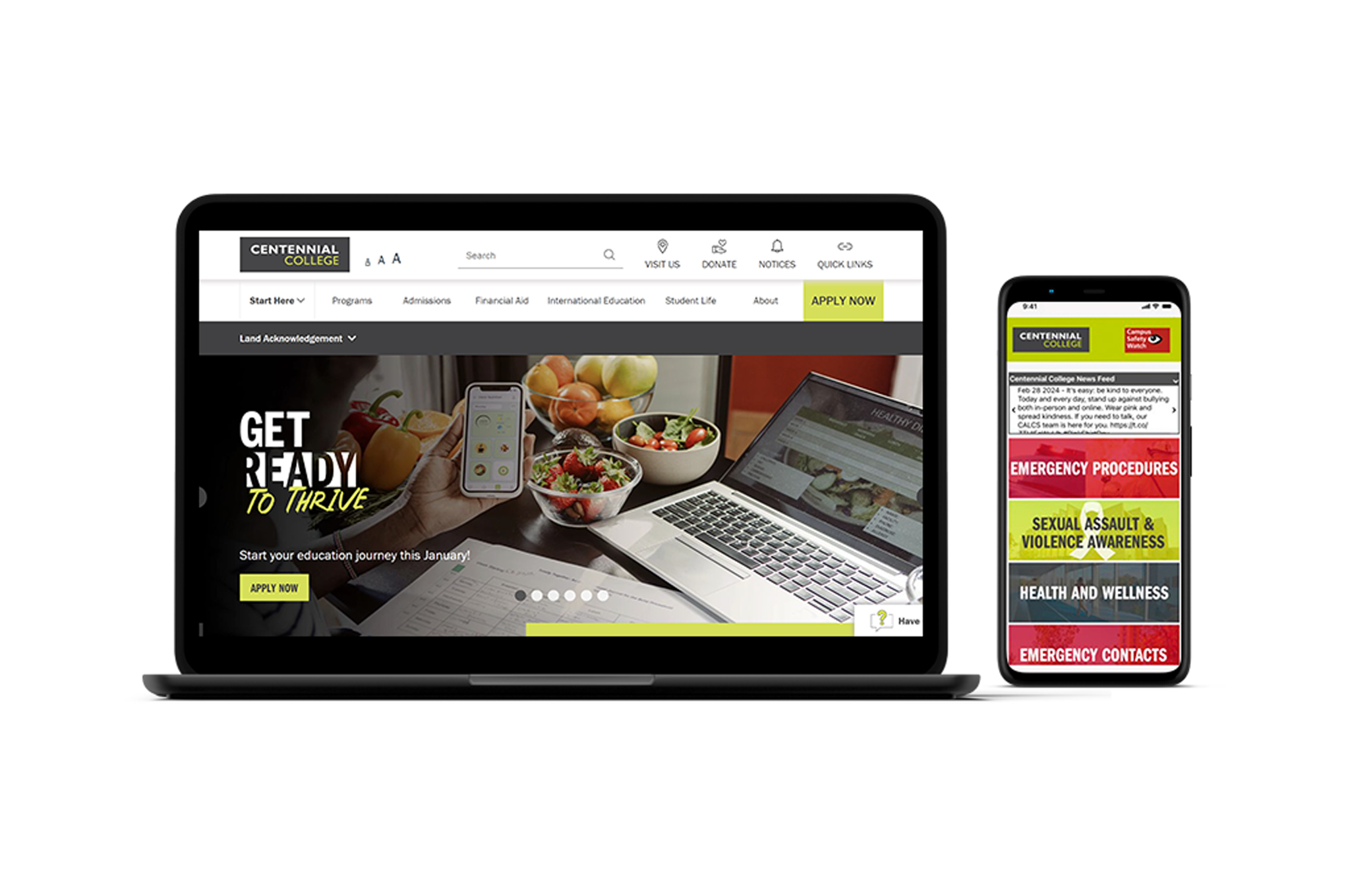
The initiative redesigned the Safety & Security webpage and mobile application to boost user engagement and help students access critical resources during emergencies.
Problem — Previous content was fragmented across multiple pages. 65% of students found navigation challenging when reporting incidents or accessing emergency contacts.
Solution — Restructured content into intuitive categories with an empathetic tone, ensuring consistency across web and mobile platforms while reducing steps to access essential tools.
Result — 90% of users reported increased confidence locating resources. 80% felt reassured by the empathetic approach.
UX Approach
Audited content across 12 pages, ran tree-testing with 15 students, and conducted 5 scenario-based interviews simulating real emergency situations.
Key insight — Students in distress don't browse — they scan. Content needed to surface the right action in under 3 seconds. Empathy in tone was as important as architecture.
Process
Heading
Research
Safety in the Moment
Safety in the Moment

Image caption

Paragraph
Students in distress don't browse — they scan. Content audits and tree-testing revealed that critical resources were buried under department-first navigation, not task-first design.
Image caption
Stats
90%
increased confidence finding resources
80%
reassured by empathetic tone
4→1
clicks to emergency contacts
Image caption
Pull Quote
I couldn't find the phone number during an actual emergency. I gave up and called a friend instead.
Student, interview #2
Image caption
Heading
Design
Designing for Distress
Designing for Distress
Image caption
Annotated Image

Image caption
[{"x":25,"y":25,"label":"Emergency contacts visible on first scroll, no menu required"},{"x":70,"y":50,"label":"Plain language replaces institutional jargon"},{"x":45,"y":75,"label":"One-tap call — no confirmation dialog in emergencies"}]
Image Gallery
Image caption
Callout
When someone is scared, they can't navigate. The redesign treated urgency as the primary constraint — every decision filtered through 'can someone do this in 10 seconds under stress?'
When someone is scared, they can't navigate. The redesign treated urgency as the primary constraint — every decision filtered through 'can someone do this in 10 seconds under stress?'
Image caption
Design Impact
Restructuring content around user tasks — not department org charts — changed how confident students felt finding help.
90% reported increased confidence locating resources
80% felt reassured by the empathetic tone
1 click to emergency contacts, down from 4
Takeaways
Content strategy is UX. How information is structured and worded changes how safe people feel. In a safety context, empathy in microcopy isn't nice-to-have — it is the product.